Sunday, 31 January 2010

Mike Rigby

Mike Rigby studied at Preston University for 4 years and manages to get a one-month placement in-between. Since then he has worked at many prestigious agencies, such as Imagination London, The Chase, Landor, Pentagram, Interbrand Australia and he now works at True North In Manchester. Mike described working at these places ‘a challenging, and educating’ where people are helpful. His work between agencies has lead to him having a very credible name in the design community. To mike the amount of negatives much out-weigh the positives, but if you are serious about becoming a designer the benefits will be found through your enjoyment of the work you get to produce.

Michael Wolff

This practitioner report is on the lecture I went to by Michael Wolff at the Liverpool design symposium in November 2009. From the point that Michael walked into the theatre it was apparent that there was something special about this man. It was almost as if he had a glow of spiritual awareness around him, perhaps it was just because he looked like some a monk of some sort, but what he was to say affirmed my initial preconceptions. Michael had been a designer for the best part of his life, and it showed due to his lack of needing to prove himself by showing the work which he had produced. The lecture existed more like an interview with another person asking questions and him answering them. My notes consist more of a list of quotes due to the profound essence of his statements. These are as follows: 'There's always room for discovery' past experience can be a hinderance as well as a benefit due to arrogance. 'Don't expect a constant meaning'. 'Get Jobs, get fired'. There is enormous potential to be successful as everything is shit'. He discussed how there is a lack of communication between designers/designs and their subsequent effect on people, and how easily the majority of people can be upset by the smallest thing. Imagination is constantly suppressed by your own mind. 'If you ask the same questions, you get the same answers'. He also mentioned something which I believe completely, how there is a lack of originality in designers and their designs. 'BE REAL, BE HONEST'. Another thin which he mentioned is the use of your own portfolio and what your portfolio actually means, i.e the demonstration of what you are trying to say about yourself, your personality and your beliefs. 'Don't take no for an answer', 'Not doing justice to our roles as human beings'. The list goes on, but basically this man is a treasure in graphic design today, and is highly influential to me not just by the designs he produces, but more about the way he sees the world and its lack of originality and substance.

Decode exhibition London


This is a picture from the Decode exhibition at the V & A in London. Although the exhibition was relatively small, there were many installations crammed in all of which were interesting and current. This particular piece filmed your actions for 3 seconds and played it on loop within a sequence of other peoples reactions. It was great fun to participate in and to see how other people responded (many were ridiculous and hilarious).

Lauren Moriarty

Lauren Moriarty has a BA (hons) degree in Multimedia Textiles (first class honours) from Loughborough University School of Art and Design (2001) and an MA in Industrial Design from Central Saint Martins College of Art and Design, London (2005). She classes herself as a textile, product and industrial designer and she has mostly works with materials, which she finds interesting and unusual. Such examples of these are different types of plastics, foams and neoprene. She became interested in these different materials while at studying for her degree, and found that with the use of laser cutting she could manipulate the materials to her will. After graduating from college she went on to do a Masters working with the same materials in more complex ways she set out to ‘brand herself’, by creating a unique selling point. While studying her Masters new techniques became available for use such as heat bonding for her 3D rubber structures she would be most renowned for.

Safe For Work Porn


Not particularly anything to do with design, but it is a brilliant and hilarious example of appropriated moving image.

Compare and contrast the work and styles of two practitioners, Mike Rigby and Lauren Moriarty


Issues and Practises Essay

For this essay I have decided to compare and contrast the issues and practises of 3D/textile designer Lauren Moriarty and graphic designer Mike Rigby from the agency True North. I have decided to compare these two artists/designers because of their obvious differences in practise and methodologies.
Lauren Moriarty has a BA (hons) degree in Multimedia Textiles (first class honours) from Loughborough University School of Art and Design (2001) and an MA in Industrial Design from Central Saint Martins College of Art and Design, London (2005). She classes herself as a textile, product and industrial designer and she has mostly works with materials, which she finds interesting and unusual. Such examples of these are different types of plastics, foams and neoprene. She became interested in these different materials while at studying for her degree, and found that with the use of laser cutting she could manipulate the materials to her will. After graduating from college she went on to do a Masters working with the same materials in more complex ways she set out to ‘brand herself’, by creating a unique selling point. While studying her Masters new techniques became available for use such as heat bonding for her 3D rubber structures she would be most renowned for. After finishing her Masters she interest from many sections of the industry, the day that she exhibited her work. She explained how difficult it was carrying out orders that were given to her with no prior knowledge of what was expected, but she stuck with it until she became bored making materials and objects just to be sold. She explains how it eventually became just a matter of consumerism and lost all of its ‘experimental fun’.
Mike Rigby studied at Preston University for 4 years and manages to get a one-month placement in-between. Since then he has worked at many prestigious agencies, such as Imagination London, The Chase, Landor, Pentagram, Interbrand Australia and he now works at True North In Manchester. Mike described working at these places ‘a challenging, and educating’ where people are helpful. His work between agencies has lead to him having a very credible name in the design community. To mike the amount of negatives much out-weigh the positives, but if you are serious about becoming a designer the benefits will be found through your enjoyment of the work you get to produce. A short list of the positives and negatives are as follows:
Positives:
Being able to communicate information (being in control of what people are subjected to).
Giving the people a voice.
Helping to tackle certain social-political issues.
Negatives:
The competitive nature of the industry as it is now, due to the amount of interest in design and the competition that brings.
Long hours with no paid overtime.
The amount of pressure and the poor quality of work of which happens as a consequence.
Initial pay is poor.
Client interference in the work produced.
Lost pitches.
Negative environmental issues.
Over packaging.
Contribution to consumerism.

The way that Mike and Lauren initially went different ways with their ascent into the industry is unsurprising as both followed the general direction of what must be done to initially succeed. Mike went straight into the industry, as did Lauren, yet Mike set out building his reputation in a very different way. Mike set out working for agencies on placements to help climb the proverbial ladder, while Lauren set out working for herself, building her reputation through freelance projects. Both of which seemed to work as effectively as the other.

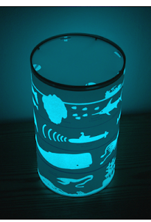
After becoming bored of working solely for the industry Lauren decided to take a step back in the hope that the experimental aspect of her work that she enjoyed so much could be reclaimed. After sorting out some studio space she set to finding innovative ways to help build her reputation. An example of which can be seen in her collaborative nightlight project. This particular project created a nightlight, which was also educational and fun for the children who it would be intended for. Lauren also discussed the importance of setting up a website for her work. She explained how easy and productive it was to set up a Paypal account, and the benefits in which resulted from this simple alteration.
Mike discussed the importance of placements and how they are an integral factor in the success of oneself as a designer. During this Mike suggested the best ways to get noticed over the sea of other design students hoping to get placements. He mentioned that showing six well-executed projects each with great ideas, will get you noticed and the importance of impressing your tutors (as it will be the same situation when you leave college). He also mentioned that interviews not only act as a process where you can show off the quality of the work you produce, but is also heavily for how well you are going to fit in with the other employees of that specific agency. This is so that when you are working with your colleagues the production of the work will flow much easier. He goes on to say other key elements in getting a placement and eventually getting a job are ‘taking professional pride in everything you do’, ‘being proactive and getting involved’, having a ‘positive attitude towards your work and the work of others’, always showing as much enthusiasm as possible, showing that you are hungry to learn and occasionally making a brew for everyone. Another interesting quote, which Mike said relates to the ethics of Michael Wolff, ‘rejection is part of design’.
The ways which both Mike and Lauren have built their reputations have differed in many ways, yet the lessons each have learn seem to be quite similar. The most beneficial aspect of having them come and give us the lectures was their attitudes towards the work which they have produced, and the overall positivity they both express towards working in a design based environment. It shows that the journey to get where you want to be may be difficult, but if you want it bad enough the rewards will speak for themselves.

Jan Vormann's website


This is a screen-shot showing Jan Vormann's website. I chose to include it because of its diversity over the style and function of other websites. It has no traditional communicative devices so that you have to find your own way through and explore each page until you find what you are looking for. The visual layout is simple and directly relates to the 'Dispatchwork' series. Another interesting aspect is how he chooses to change the layout occasionally, showing that nothing should be set in stone and should always be questioned and altered. I am in love with the work and the way of thinking that Jan communicates, in my opinion he is one of the most interesting artists of our time.

Jan can be found at http://www.Janvormann.com

Bag Monsters - Joshua Allen Harris


This is another great example of a simple installation idea. The heat vents emitting hot air cause the bags to inflate into the shape of the monster. There's something beautiful and inspiring about these kind of installations, creating an artistic use for something which has no other use than its intended function is fascinating to me. Doing these kind of installations opens your eyes to things you would not normally notice.

Street Art


I came across this while researching urban installations for my FMP. Closely related to the depth perception work by Georges Rousse, this work uses the same principles but is carried out in the urban environment. The paintings are laid out so that from a specific point the work can be seen to have depth, while from another it is distorted and stretched. Again the work which must go into the design and execution of these paintings is astounding.

Guerilla Gardening


Guerilla Gardening is a relatively new collective which encourages people to go into the urban environment and plant flowers in unusual places. I like this idea as it is something which is open to everyone to do and not just the artist. It is also interesting how the border between what can be classed as graffiti is blurred as the guerilla aspect usually has negative connotations, yet the planting of flowers is a completely ethcial aspect.

Creative Fencing


This is yet another aspect of research into the urban environment. When looking at interesting aspects of the environment which can be altered I came across fences. Usually existing as barriers, fences have no other function. As they are usually shaped in a grid of some sort there may be a way to make them communicate something using typography. Here are some examples of how other artists have tackled this.

(www.heapsgood.wordpress.com)

Jan Vormann


Jan Vormann is an artist I was referred to by a classmate while trying to decide what to do for my FMP. His work is fun and interesting, and is based heavily on ideas of childhood and nostalgia. This particular one entitled 'Dispatchwork' is an almost futile attempt at repairing damaged or weathered walls with lego of different colours. The reason it could be classed as futile is because the lego doesn't make any structural difference, and there is way to many holes and damaged structures for him alone. Yet the nostalgic and colourful effect it has on the viewer (and availability for anyone to do) has inspired people to go out and do it themselves. This is probably the best and most beautiful idea I have ever come across, and I will be messaging Jan soon with a questionairre to inspire me further.

Guerilla Marketing


As being interested in anything 'guerilla' related, I am always on the lookout for examples of work which responds in this way. Other examples of guerilla design can be seen on my previous blog 'codex alimentarious'. I especially like the 'bottom' one as it is hilarious and would definitely function as a great tool for advertising purposes. I found these while researching into my FMP.

Skater Tetris!


Not much to do with design really, but definately worth a watch. I think I like this idea mostly because of the collaborative element. Its fun, simple and interesting. Check it out.
Via heapsgood.com

Louis Wain


Louis Wain is somebody I have only recently discovered, but from what I have read he was an artist who was obsessed with painting cats. What I find interesting is the use of colour and geometric shapes, its almost impossible to imagine how he felt or his reasons for dong what he did, but its also incredibly intriguing. Apparently he had Asperger's syndrome, which gradually got worse over time, causing his work to become more obsessive and colourful.

Images via www.seancasio.wordpress.com

New York Visit 1


This was the first of my visits in New York. After getting the subway to Brooklyn with Jack and Jordan, we found our way to a small cafe where we met with Designer Andrew Almeter. As they didn't really do things the same over with the showing of portfolios, there was some confusion to what was expected, but the atmosphere was great and he gave us some great ways to improve our portfolios. One aspect of my portfolio which could be improved was the inclusion of more sketches and general ideas generation processes. He suggested perhaps producing a small book which shows this to go along-side the portfolio. Overall he seemed to really like my work and it was a great experience for us all.

A really, really good idea!


Good Ideas seem to be a recurring theme for my blog (as they should be) but it is becoming more obvious how it is not just design that interests me, as long as the idea is good it is good for me. Based on the idea that different levels of water within bottles make different notes, these guys have gone one step further and made a hybrid using a remote controlled car. Basically, car goes straight with beater attached, bottles have the precise amount of water to make specific note, car plays music with bottles. The choice of Mario as the tune is also a great choice due to values of nostalgia.

Shadow Art


When I first saw these I was convinced they were not real (they were actually that good). The amount of time and effort that must have gone into each one is insane. A light is directed onto a pile of rubbish which uses a wall as a background for the shadow which is created. The main things which interest me about this project is the way the work has almost two functions and dimensions to it. Physically it is two pieces of work, one being the pile of rubbish and the other being the shadow which is created. I guess what interests me the most is the way something (which has no use and looks horrible) can have an ulterior effect due to the way it is presented. Bad instantly being transformed into good.

Alex Grey


Holland and Barrett


Second year Urbis movie 2


This is the second example of the year two work I did for Urbis in Manchester. We had to create an animated end-sting using flash. As I was already familiar with flash software I decided to produce two to challenge what I knew about flash. This one focused on the use of the existing web-based imagery which Urbis uses. I thoroughly enjoyed this brief, and because of which I believe it shows.

Second year Urbis movie 1


This is the first example of the year two work I did for Urbis in Manchester. We had to create an animated end-sting using flash. This one uses the negative space in the typography. For this one I used motion tweening, as it was a requirement of the brief.